Thank you for visiting my blog!

In my blog I will capture my inspirations behind paintings I have created and share new techniques that I have tried.

Monday 29 September 2014

Custom wedding portraits

In this post I want to make a brief overview of  how I created my new series . For the last 5 months I focused on painting abstract figures, including weddings and couples.

 
How it started
I had a small studio space at my home , 3 full sketch books and curiosity to do mixed media art with watercolours .


So I have started painting small size figure works (8 x 10 inches) combining watercolours, gouache and ink. I did not have anything specific in mind and wanted to go with a flow of a creative process. This was my first painting:


Techniques and my new style

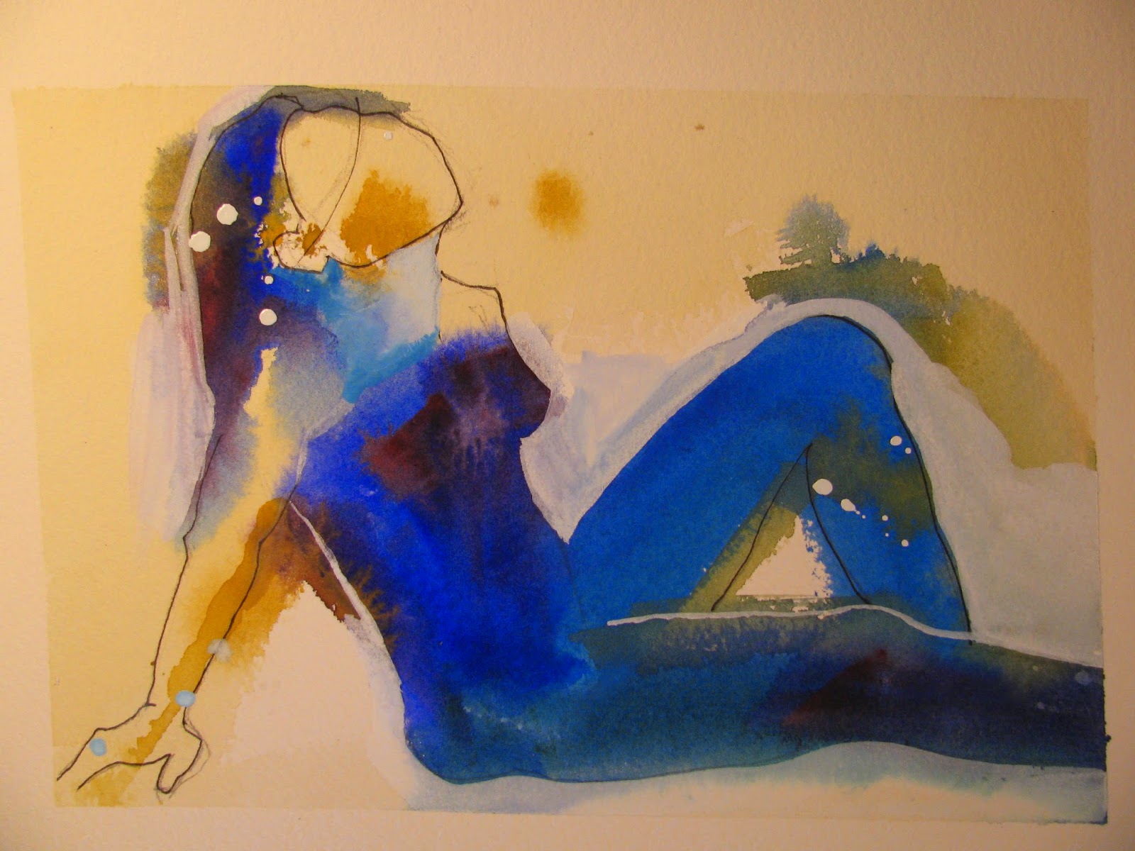
I always was drawn to make mixed media paintings. This time I wanted to get to the result of combining fluidity of watercolours and dry opaque paint of gouache.  To make my works more expressive I used techniques of dry brush, wet-on-wet, dripping and stamping . I chose not to add facial features to keep figures more abstract and with the touch of mystery.


Meaning of my art

For me art is a way of expressing thoughts and emotions. In this series my main goal is to show love and connection between two people trying to visualize a happy relationship.


Buying painting as a gift
 

The first painting that has been purchased from this series was bought as a wedding gift. Since then I  paint a lot of custom weddings paintings using photo references or my sketches with option of modifying dress style, skin colour, hair cuts of a couple. Most of my customers buy my paintings as gifts for weddings, engagements, wedding anniversaries, or just as a gift representing a non romantic friendship.


If you are interested to see more of my paintings go to Etsy website where I sell original paintings only:


https://www.etsy.com/shop/AbstractFiguresShop?ref=hdr_shop_menu


Wednesday 17 October 2012

The Sketchbook Project 2013


One of my friends-artists told me about ‘‘ The Sketchbook Project’ last year. It is an ongoing project of Brooklyn Art Library in New York. They provide you with 5’ by 7’ sketchbook where you can express yourself creatively on any topic you want. You could be a professional or amateur artist, or just person who likes to sketch or write . I looked at their digital library and there were people who sent their poems, diaries, illustrations, sketches, paintings..you name it. You need to send your creation till January 15, 2013 and then the library travels through North America to showcase the sketchbooks received from all over the world. I think it is a unique project and I decided to participate in it this year!  

The challenging thing was to know how to use this small book for my big ideas :)  I decided to choose one theme and one colour scheme in order to be consistent. Since I painted a series of yoga poses this summer, I continued this idea.  I do yoga on weekly basis and it makes me feel positive and energetic.  So, I wanted to share with others how beneficial yoga is for our bodies and minds.  I have drawn contour sketches of a woman doing different yoga poses. In order to make it a bit interesting I played around with copying a stencil of the word ‘yoga’ of different sizes. I worked with an ink pen and markers of silver and gold colours. 

I have almost finished my sketches and will be sending it very soon to NY. I have also purchased the option of being in a digital library which gives additional venue for my online representation as an artist.

Check their website if you are interested:  http://www.arthousecoop.com/projects/sketchbookproject

I think this project is a great opportunity for everyone to share their creativity with the world! 


Wednesday 1 August 2012

Art, yoga and life in one. 'Balancing' series

Currently I am renting my first formal studio space in Imagine Art School and Gallery and working on new figurative and abstract series. It is a great experience to work in a studio! I have a big room for myself. I do not worry of taking away paints and tools to the storage, and I have an opportunity to come painting whenever and how often I want.

Recent classes with professional artists Bianka Guna and Brian Smith inspired me to integrate both of my favourite themes-abstract and figurative painting- in one. “Balancing” figurative abstract series is about balancing between positive and negative sides of life and ultimately accepting the life as it is- having different colours. The image of a woman doing balancing yoga poses is a representational image of my idea. The physical and mental balancing requires the same- strong core, flexibility and sense of balance. This body of works is about the process of balancing and not being in a state of balance. Next moment may bring unexpected news -joy or sadness –and we need to know how to rebalance ourselves in order not to fall.
This series are mixed media works. I used fluid acrylic, pastel as well as added newsprint and Japanese rice paper, experimenting with different techniques, such as: scrapping, pouring, stamping and collage. The blue colour scheme suggests a calming, yet peaceful mood, the feel emotional acceptance brings.

To show my working space and new series, I am planning ‘Open Studio and Art Show’ on August 23 & 24 between 7-9pm, and August 25 & 26 between 2-5pm.  I will also exhibit abstract series done in a past year. The exhibition will take place in Imagine Art School and Gallery located at 12 Centre Street in Thornhill (north west corner of Yonge and Centre). It is a free public event, so come and bring your friends! 


Sunday 6 May 2012

Sketching People


This post will be on sketching people and integrating collage into background. I love to sketch and  I try to do it when I have an opportunity and a muse :) I took number of figure drawing classes (with instructions and without) and only recently I became comfortable enough to sketch in public places.
I was told by my instructors that sketching is a good drawing exercise and that I need to sketch when I have free time. That was so good advice! I noticed that more I sketch, better it gets. Also sketching gives me opportunity to enjoy drawing  when I cannot access my easel and brushes. Last, but not the least it is fun and inspiring!
So here are my personal strategies that I use in sketching strangers:
1.       Places to sketch: I usually sketch people in cafes, parks and on the beach. It is the place where people come to relax, read and work on the computer. The main goal is that the person whom I draw won’t move too much. 
2.       Finding the right spot: not too close from a person whom I want to sketch.  I do not want to draw attention. But it should not be too far either, I would like to see some general details (shadows, posture, clothing items), unless I particularly want to draw silhouettes.  
3. Finding repetitive gestures or movements of the person. If the person moves every few minutes, I start few sketches at the same time. It gives opportunity to work simultaneously on 2 sketches without making a break. By the end hopefully I finish them all. 
4.       Sketching general details: I usually try not to care about similarity. It is only a learning exercise on shapes and forms of people’s body for me. The similarity might become the issue if I decide to have it as a reference for the final work and sell it. There is an interesting discussion on wetcanvas on this topic: http://www.wetcanvas.com/forums/showthread.php?t=126622 
5. Contour sketching: I am amateur artist, so I am still learning how to draw fast. So most of the time I do a contour sketch, because it allows to do it quickly without measuring a model. If I have time I add some shadows, usually where I decide to make a focal point. 
6. Adding details from the surroundings: I sketch it last or even when the person is gone. It is important that the surroundings won’t compete with the main subject.
During my last sketching on the beach, I decided to experiment with adding colour to the background. Since I am doing a lot of mixed media lately by adding Japanese rice paper, I decided to take paper to the beach instead of colour pencils. I used tears of Japanese rice paper to block a background and tried to make it in an abstract way. Take a look what I got and share your tips how you sketch in public places.


Monday 16 April 2012

Using reference in abstract painting. Limonana series.


Last year I have joined Israeli artists group of Toronto which organizes art exhibit annualy. For this show I have decided to continue the theme of exploring my Israeli part of identity through food. I chose my favourite summer drink-Limonana which is popular in Israel. It is a refreshing  iced smoothie from fresh lemon juice and mint leaves. In Toronto you can find it in ‘Aroma’ cafĂ©, but it is also very easy to make it at home in a blender.
For 4 cups (one liter) of ice limonana:
2 cups of ice
1 cup fresh lemon juice (from about 4 large lemons)
1/2 cup spearmint leaves (from about 40 stalks), plus a few more to garnish
4-6 tablespoons sugar (or to taste)
Juice the lemons, and remove the mint leaves from the stalks. Dump all ingredients in a blender, and blend until smooth.
Serve garnished with mint.
 
 
 ‘There is no abstract art.  You must always start with something.  Afterward you can remove all traces of reality’,-Pablo Picasso. Said that, I have used reference photographs to come up with the compositions. I wanted my paintings  to be non-objective , so I was just guided by the forms , shapes and colours from the photos. To build a colour scheme I picked colours which represent mint, lemon and the blended drink, and added purple colour to make the complimentary colour scheme.  I am always looking for the colour contrasts, especially to highlight the focal point of the painting. I continued using collage and drips in this series as well. The new thing in these works is that I have used new scrapping tools which I bought recently.
I will exhibit 4 paintings from ‘Limonana’ series  in IGAT art show which will take place on May 17-20, 2012 in McDonald House, Thornhill. 25 artists will present there works, including painting, sculptures, ceramics and jewellery. 


Monday 13 February 2012

Abstract cityscapes series-'Mirage'


‘Mirage’ is abstract cityscapes series that I have been working on for the last two months or so. In this series  I continued the idea of transforming the realistic urban scenes  to the abstract. I started from palette of 4 colours that are most appealing to me which are oranges and blues, and made about 20 sketches. I have learned that more sketches you paint are better.  It gives the opportunity to experiment and then to choose most successful ones.

While sketching , I have referred to photos or scenes that I have seen , but mostly I improvised.  I think improvisation is a key in abstract painting! After I have painted few paintings, one of my fans commented that I should call the series –mirages.
I researched mirage phenomenon online and found interesting facts about it. I was surprised how matching this association was to my colour scheme and the compositions! As you know mirage are the physical optical phenomenon which could be photographed. It happens mostly in desserts, seas and highways. In brief, it is a reflection of trees, buildings or water through different layers of air. Sometimes these images could be seen upside down. So ‘Mirage’ it is!
In this series I continued my favourite medium – fluid acrylic paint with collage. Newsprints of Russian, Hebrew and English texts  are from Toronto newspapers that I have found at home. I like to see the integration of texts and Japanese rice paper in the painting. For me the painting doesn’t look finished if there are no paper additions. Also while painting this series, I started to experiment with drips which I observed in the works of many artists , but never had courage to  try. I have learned that it is the most uncontrollable technique I ever used! It was scary in the beginning , but in the end it made painting interesting and look like something alive.  
The next step is my exhibition in March at Gallery F (George Brown College) where I will exhibit my abstract cityscapes series ‘Mirage’ and ‘City of Neighbourhoods’ to the public critic.

Friday 23 December 2011

Abstract Mixed Media

About a month ago I have taken an amazing workshop on a wet-on-wet  acrylic technique and mixed media . We used fluid acrylic which I never used before and it opened a new world for me! This paint has a lot of pigment and allows combining the effects of water colours and oil in one. Since then I am experimenting a lot with ‘Golden’ fluid acrylics and adding collage to my paintings. Previously Picasso’s collages inspired me to add newspaper print and Japanese rice paper to my realistic paintings, and I continue doing it with abstract paintings too. It seems that while painting abstract compositions, you need to connect to your inner world in order to create a visual impression. You are using you mind, emotions and may be sub-consciousness to express yourself in abstract way. It frees you and you create a different kind of beauty. Said that, the compositions are often inspired from realistic scenes or /and experiences. The last painting that I have done called “Warm snow” (Mixed media on w/c paper, 14’ x 17’). It was inspired by an image seen while driving along the
Bathurst  Street
in the early evening. The sky, road and cars around seemed all blue from darkening sky and rare snowflakes. The snow was melting in the air and the red lights of cars ahead of me were making long reflections on the wet road. It created an abstract image in my mind of red long strips on a blue canvas.  This combination of warm and cold colours inspired me to make a series called ‘Warm Snow’.